John Morgan: The Grand Detail
Small Certainty
John Morgan died on 2 September 2025, aged 52, in his library in Oxfordshire. His work ranged widely, but was united by the same precision and judgement. It includes the Church of England’s Common Worship, books made with artists, identities for architects and galleries, the lettering of HMS Victory, the graphics of the 2012 Venice Architecture Biennale, the art direction of AA Files and ArtReview, and a generation of students taught to regard typography as both exacting craft and cultural argument.
An Eye profile published in 2012 caught the practice at a revealing point. Morgan was already known as a careful, even-tempered typographer, yet the work could also be theatrical, disruptive and very large. He refused the choice between those positions. Typographic detail and the grand gesture belonged to the same task: establishing an atmosphere appropriate to the material. The years that followed confirmed the strength of that idea, extending it across ships, museums, magazines, typefaces and books of his own.
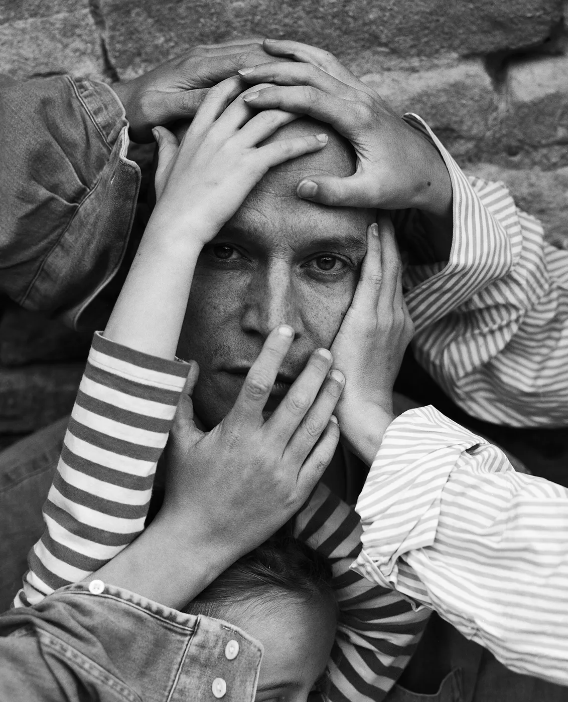
THE USEFUL SEVERITY OF READING
Morgan was born in Galgate, Lancashire, in 1973. His father was a biochemist with an interest in stationery, and the family home encouraged open criticism. At the University of Reading, where Morgan enrolled in 1992, typography was taught through history, theory and the practical consequences of every decision. Michael Twyman, James Mosley and Paul Stiff made the subject intellectually serious; Stiff’s severe criticism made it difficult for a neat arrangement to pass as a considered one.
After graduating in 1995, Morgan joined Derek Birdsall’s Omnific studio. Birdsall supplied a second education, built around authors, printers, deadlines and the physical intelligence of a page. Morgan later described the ideal succinctly: settle the details, then introduce one beautiful thing that makes the object particular. When he established John Morgan studio in 2000, he carried forward both halves of his training—the historical scrutiny of Reading and the direct, editorial judgement of the atelier.
A PRAYER BOOK FOR USE
Common Worship was the first project to make the scale of Morgan’s ability widely visible. Begun with Birdsall and taken into Morgan’s new studio with his mentor’s blessing, the commission replaced the density associated with a traditional prayer book with generous space, warm ivory paper and a clear hierarchy in Gill Sans. Its beauty came from practical questions: the paper had to be durable but light, the text readable in poor church lighting, and prayers kept on a single page so that a congregation would not rustle through a recitation.
The bishops were exacting clients, and Morgan treated their requirements as material rather than interference. That response became characteristic. A constraint was not something to disguise after the design had been imagined; it was where the design began. Common Worship would be handled weekly by more than a million people, so its authority could not depend on an arresting cover or a designer’s signature. It had to emerge through repeated use, in the weight of the volume, the sequence of a service and the ease with which a reader found the next line.
GOOD DESIGN IS A BRANCH OF EDITING
Books remained central to Morgan because they joined language, sequence, material and time. For Four Corners Books he designed the Familiars series, allowing each artist’s response to a classic text to alter the form of the volume. For the Architectural Association he recast AA Files as a quieter and more literary journal, using Fred Smeijers’ Arnhem Blond for extended reading while permitting display typography to change from issue to issue. The system held, but it never became a cage.
Morgan’s observation that good design is a branch of editing explains the apparent ease of these publications. Editing is not merely subtraction. It is the establishment of relationships: deciding when a caption should interrupt an image, how a typeface changes the temperature of an argument, and which historical reference can remain alive rather than becoming pastiche. His 2012 account of the studio repeatedly returned to content and relevance. A publication deserved design only when there was something worth reading, and the design had to belong to its own moment.
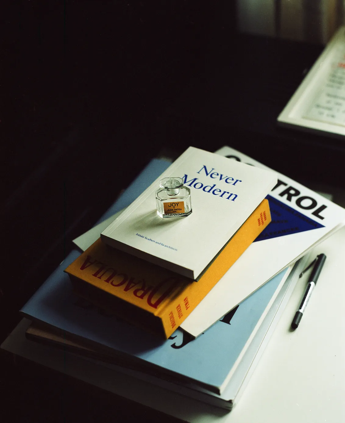
FROM THE PAGE INTO THE BUILDING
Morgan aimed for atmosphere—the sensation of entering a building and feeling that the conditions have changed. He believed a book could produce the same effect. This made the movement from page to architecture less abrupt than it might appear. Identities for David Chipperfield Architects, 6a architects and Raven Row, lettering for Tate Britain, and graphics for exhibitions turned typography into something encountered at walking speed and across distance, without severing it from the habits of close reading.
The 2012 Venice Architecture Biennale demonstrated the method at civic scale. Morgan’s studio drew on Venice’s stencilled street signs, making a letterform native to the city carry the exhibition through rooms, publications and public space. The result won the Design Museum’s graphic design award in 2013. Morgan called his relationship with architects critical compliance: support the larger project, understand its discipline, but retain enough independence to question it. Chipperfield’s description was plainer. When everyone shouts, whisper; Morgan was a very good whisperer.
HISTORY AS WORKING MATERIAL
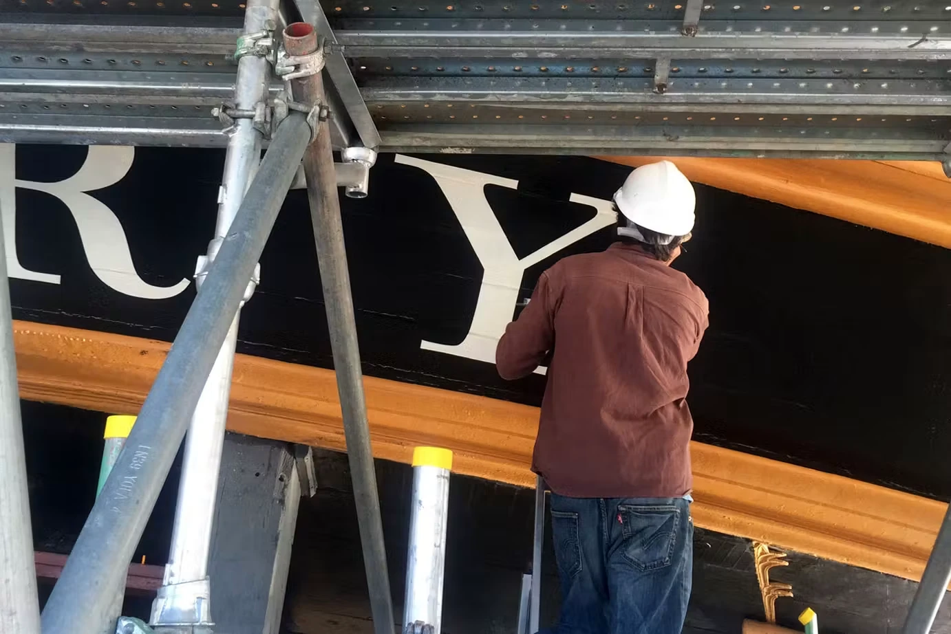
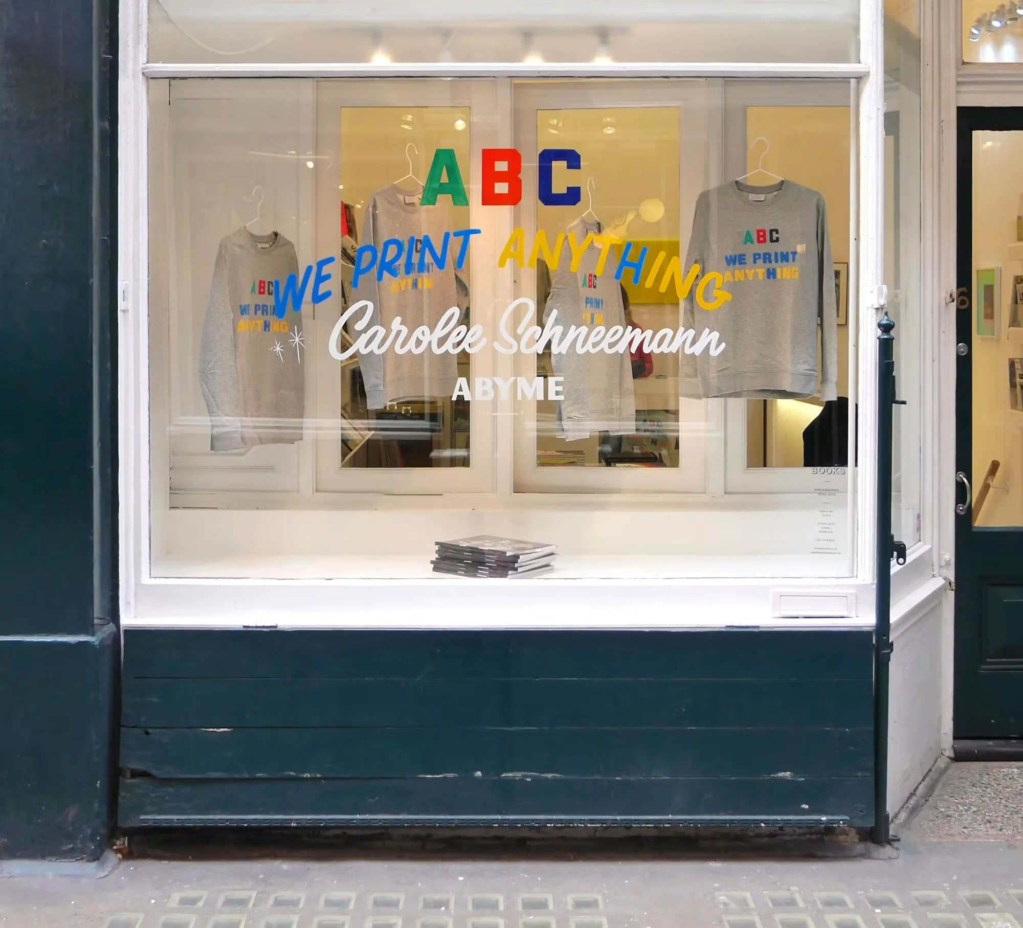
Morgan’s historical knowledge did not make him nostalgic. For the 2015 repainting of HMS Victory, he and Adrien Vasquez replaced an anachronistic stern treatment with lettering informed by contemporary naval paintings. Two years later they founded the digital type foundry Abyme. The projects belong together: both treat historical forms as evidence to be examined, reconstructed and made useful in the present, rather than as a decorative style waiting to be borrowed.
That attitude also animated his teaching. Morgan taught book design at Reading and, from 2016, served as professor of Design, Typography and Book Art at the Kunstakademie Düsseldorf. He wanted students to combine the typographer’s command of negligible details with the artist’s ability to see the whole situation. The standard was exact without being obedient. A designer should know why a convention exists, what it permits, and when the project has earned the right to depart from it.
THE BOOKS AT THE END
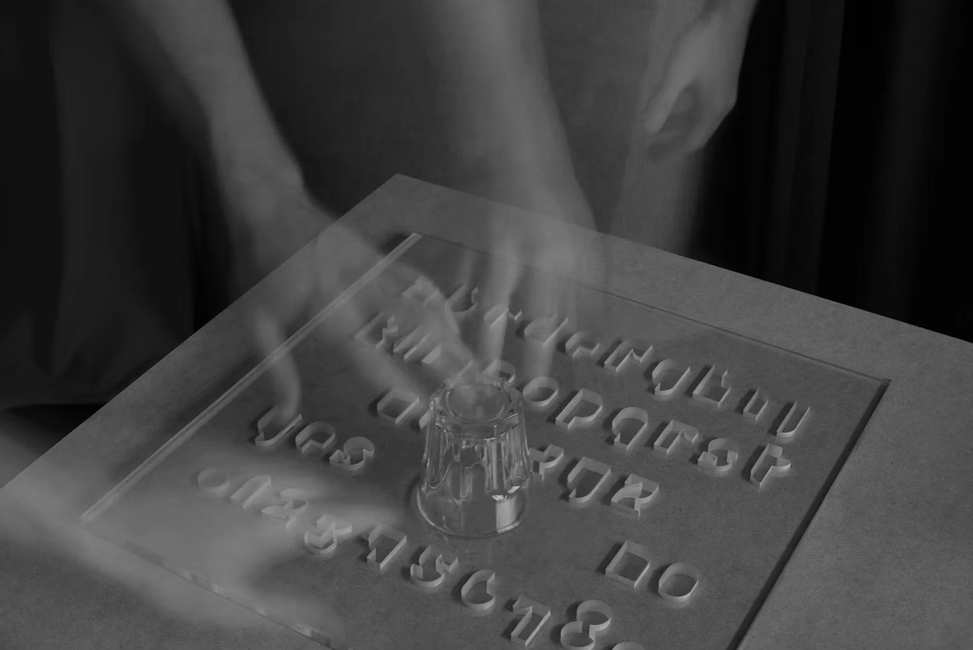
In 2021 Morgan published Usylessly, an examination of the first 1922 edition of James Joyce’s Ulysses as a physical object rather than a literary text alone. In 2025 he established Ten Thousand Angels Press and completed a second edition shortly before his death. He also finished Baskerville’s Teardrop Explodes: A Selection of Books as Muses, a final account of books as objects that carry accidents, histories, marginalia and private attachments alongside their printed words.
Morgan’s death makes the restraint of his work feel more, not less, consequential. The pages and signs were never quiet because he lacked appetite for a gesture. They were quiet because he knew precisely where a gesture would matter. His legacy is present in celebrated commissions, but also in a more durable standard of attention: read before arranging, understand the object before styling it, respect the people who will use it, and leave enough life in the system for one unexpected thing to occur.